Flutter 3 supports Material Design 3 (M3).
https://m3.material.io/” target=”_blank” rel=”noopener noreferrerHowever, it is not fully compatible, and there are some widgets that are not supported for M3.
For more information on the status of Material Design 3 support↓
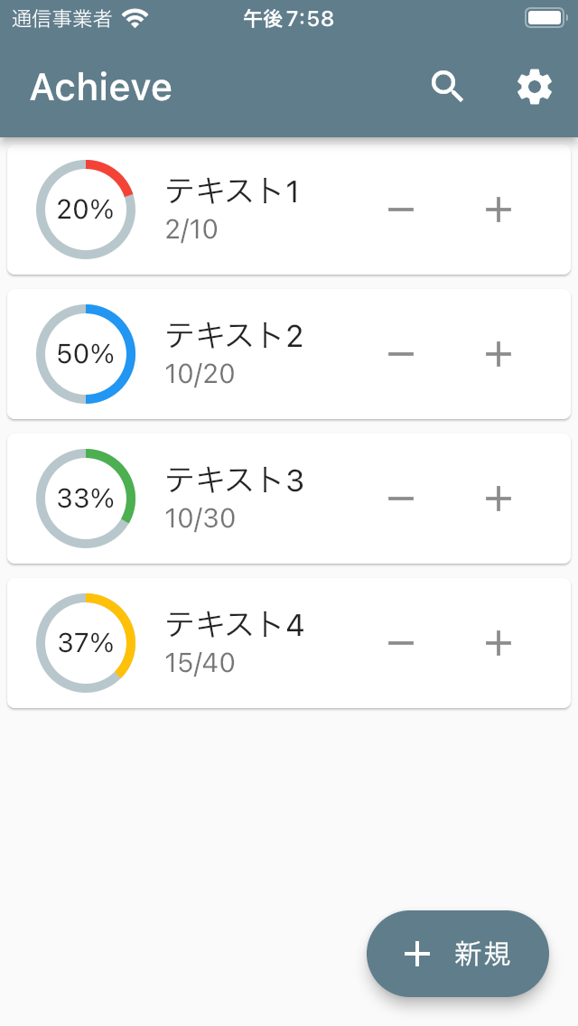
https://github.com/flutter/flutter/issues/91605″ target=”_blank” rel=”noopener noreferrerThis article summarizes the process of making my application “Achieve: ToDo Counter” compatible with Material Design 3.
https://enoiu.com/en/app/achievement/Dynamic color is not implemented in this article.
About Dynamic color: https://m3.material.io/styles/color/dynamic-color/overview
Environment
[✓] Flutter (Channel stable, 3.0.0, on macOS 12.3.1 21E258 darwin-arm, locale ja-JP)
[✓] Android toolchain - develop for Android devices (Android SDK version 31.0.0)
[✓] Xcode - develop for iOS and macOS (Xcode 13.3)
[✓] Chrome - develop for the web
[✓] Android Studio (version 2021.1)
[✓] VS Code (version 1.67.1)
[✓] Connected device (4 available)
[✓] HTTP Host Availability
Apply Material Design 3
At this time, Material Design 3 is not automatically applied in Flutter.
These changes will be provided as an opt-in solution for now and the current Material 2 functionality will remain a part of the framework for a while (at least 1 year+). This will give developers a lot of time to opt-in and move over their projects.
https://github.com/flutter/flutter/issues/91605
To apply Material Design 3, add useMaterial3: true at ThemeData.
Also, change primarySwatch to colorSchemeSeed.
By settings colorSchemeSeed, you can apply a color system that conforms to Material Design 3 to your app.
ThemeData(
 useMaterial3: true,
 colorSchemeSeed: Colors.blueGrey,
 brightness: Brightness.light,
)| Before | After |
|---|---|
 |  |
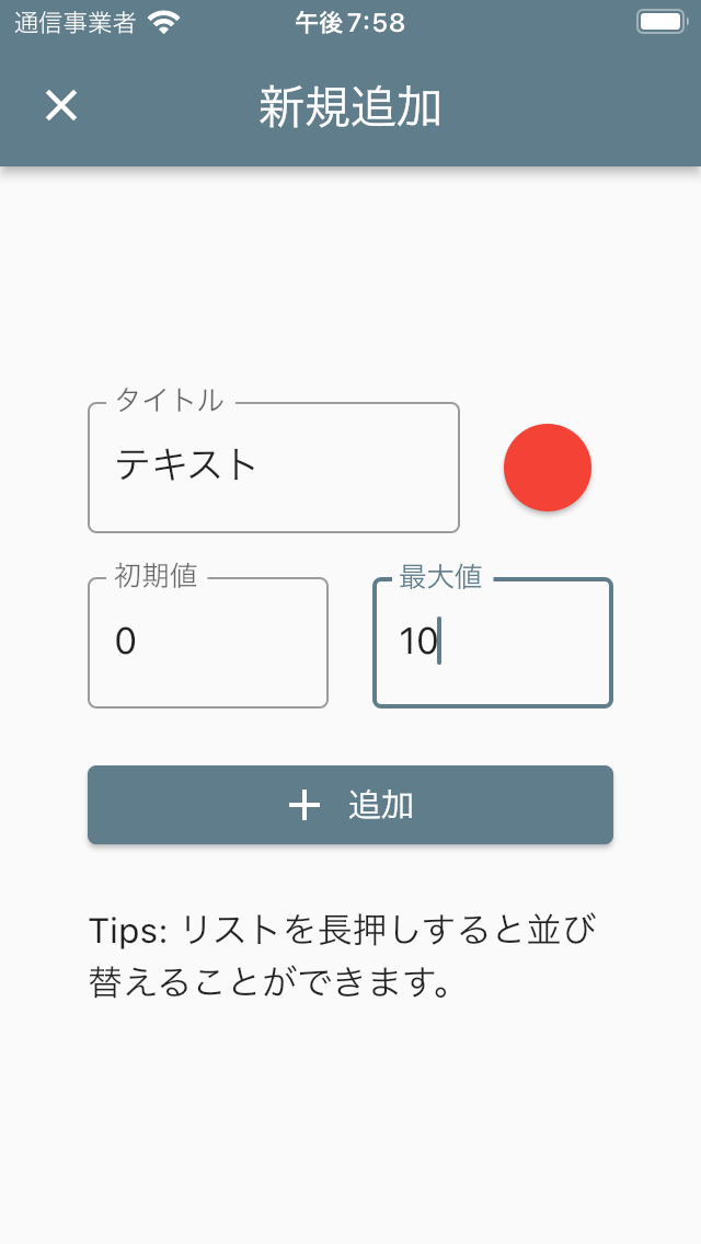 | 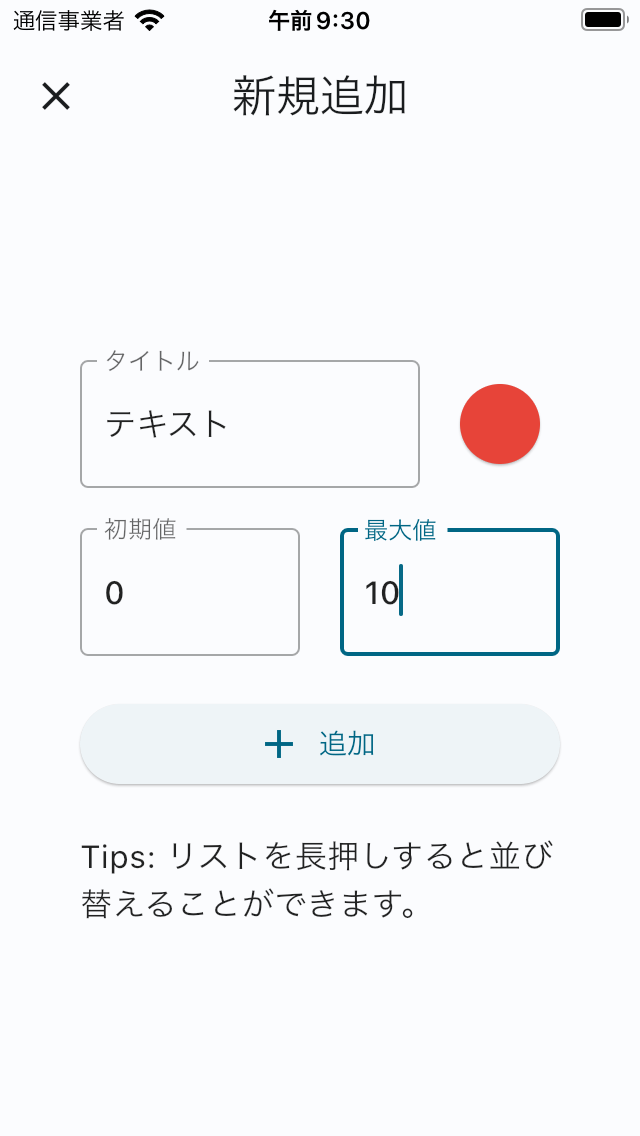 |
You can see that the color and shape of the AppBar, Card, FAB(FloatingActionButton), and ElevatedButton have changed.
Personally, I am glad to see that the AppBar is now a whitish color, as I felt that the color of the AppBar was a bit bland (by the way, the color becomes a bit darker when scrolled down).
I think it looks good overall, but the ElevatedButton has become whitish and hard to see, so I would like to change it.
I would like to change it to something that conforms to Material Design 3.
ElevatedButton
ElevatedButton in M3
The ElevatedButton in Flutter corresponds to the Contained button in Material Design 2.
https://material.io/components/buttons” target=”_blank” rel=”noopener noreferrerFor this Contained button, Material Design 3 divides it into three types: Filled button, Filled tonal button, and Elevated button.
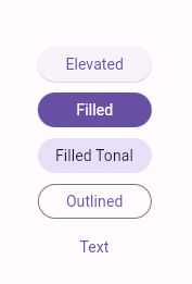
| Flutter | Material Design 2 | Material Design 3 |
|---|---|---|
| ElevatedButton | Contained button | Filled button, Filled tonal button, Elevated button |
| OutlinedButton | Outlined Button | Outlined button |
| TextButton | Text button | Text button |
Filled button
A button indicating the next most important thing after FAB.
The filled button’s contrasting surface color makes it the most prominent button after the FAB. It’s used for final or unblocking actions in a flow.
https://m3.material.io/components/all-buttons
Filled tonal button
A button that is less emphatic than the Filled button but indicates something important.
Filled tonal buttons have a lighter background color and darker label color, making them less visually prominent than a regular, filled button. They’re still used for final or unblocking actions in a flow, but do so with less emphasis.
https://m3.material.io/components/all-buttons
Elevated button (Material Design 3)
The use case shows that it is less important than the Filled tonal button and about the same importance as the Outlined button?
Elevated buttons are essentially filled buttons with a lighter background color and a shadow.
https://m3.material.io/components/all-buttons
Therefore, the importance that a button indicates is
Filled button > Filled tonal button >= Elevated button (= Outlined button > Text button) ?, I think.
Filled button in Flutter
In this case, there is only one button on the screen, so I use the Filled button to indicate that it is highly important.
An ElevatedButton in Flutter will be an Elevated button in Material Design 3 if nothing is specified.
Since there is no widget called FilledButton in Flutter at this time, a style must be added within ElevatedButton to make it a Filled button.
For now we are suggesting using the existing ElevatedButton with styles to achieve the Filled and Filled Tonal looks. You can see examples of these in the sample added for the PR:https://github.com/flutter/flutter/pull/100794/files#diff-aac3a34e6f8e5c540516600483774c89534da079af53feb8ea1ac7dd76c1558b
https://github.com/flutter/flutter/issues/99022
We may look into adding subclasses for these, but we were trying to be conservative with adding new APIs.
Filled Button↓
ElevatedButton.icon(
  style: ElevatedButton.styleFrom(
    // Foreground color
    onPrimary: Theme.of(context).colorScheme.onPrimary,
    // Background color
    primary: Theme.of(context).colorScheme.primary,
  ).copyWith(elevation: ButtonStyleButton.allOrNull(0.0)),
  onPressed: () {},
  icon: const Icon(Icons.add),
  label: const Text('追加'),
)| Elevated button | Filled button |
|---|---|
|  |
Now that’s an easy button to see!
For Filled tonal buttons, apply the following style.
style: ElevatedButton.styleFrom(
  // Foreground color
  onPrimary: Theme.of(context).colorScheme.onSecondaryContainer,
  // Background color
  primary: Theme.of(context).colorScheme.secondaryContainer,
).copyWith(elevation: ButtonStyleButton.allOrNull(0.0)),
Card
Card in M3
Regarding Card, Material Design 3 defines three official card types: Elevated card, Filled card, and Outlined card.
https://m3.material.io/components/cards/guidelines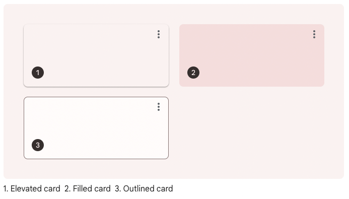
The card in Flutter is an Elevated card if nothing is specified, and can be a Filled or Outlined card by setting the elevation, shape, etc.
Whether or not one should be chosen seems to depend solely on style, since all are the same in terms of readability and functionality.
The degree of separation from the background is
Outlined card > Elevated card > Filled card
Each provides the same legibility and functionality, so the type you use depends on style alone.
https://m3.material.io/components/cards/guidelines
Filled card, Outlined card in Flutter
To make it a Filled card, add the following code in Card().
elevation: 0,
color: Theme.of(context).colorScheme.surfaceVariant,
For Outlined card, add the following code in Card().
elevation: 0,
shape: RoundedRectangleBorder(
  side: BorderSide(
    color: Theme.of(context).colorScheme.outline,
  ),
  borderRadius: const BorderRadius.all(Radius.circular(12)),
),
I tried Outlined card for this application.
| Elevated card | Outlined card |
|---|---|
|  |
It is hard to say which is better.
I felt Outlined card is simpler than Elevated card, so I decided to adopt Outlined card for now.
Icon
Icon(Icons.~), which are often used in Flutter.
This is an icon provided by Google called Material Icons.
https://fonts.google.com/icons?icon.style=Filled&icon.set=Material+Icons” target=”_blank” rel=”noopener noreferrerIn Material Design 3, Material Symbols, not Material Icons, will be the default icons.
https://m3.material.io/styles/icons/overview” target=”_blank” rel=”noopener noreferrer https://fonts.google.com/icons?icon.set=Material+Symbols” target=”_blank” rel=”noopener noreferrerMaterial Symbols is a variable icon font that can change four attributes: weight, fill, optical size, and grade.
Also, in Material Icons, the contents of the icons were filled in by default, but in Material Symbols, it seems that they are not filled in by default.
Currently, Flutter does not support Material Symbols.
https://github.com/flutter/flutter/issues/102560″ target=”_blank” rel=”noopener noreferrerHowever, I tried to make it look like that by using outlined icons from Material Icons.
- Icon(Icons.settings)
+ Icon(Icons.settings_outlined)
Correspondence to AppBar color change
In this application, when using the search function, a TextField is specified in the title of the AppBar to allow input.
Until now, the AppBar and TextField were the same color and the text was invisible, so I had to set the font, cursor, and border colors of the TextField to Colors.white.
In Material Design 3, the AppBar is the same color as the background, and the text is now properly visible without specifying a color in the TextField, so I eliminated the color specification.
Others Dialog, etc.
Check to see if the layout is broken or any other UI issues arise as a result of Material Design 3 compatibility.
For example, Dialog changes as follows.
| Before | After |
|---|---|
 |  |
The following widgets are currently compatible with Material Design 3.
- AlertDialog
- AppBar
- Card
- Dialog
- ElevatedButton
- FloatingActionButton
- Material
- NavigationBar
- NavigationRail
- OutlinedButton
- StretchingOverscrollIndicator, replacing the GlowingOverscrollIndicator
- TextButton
These Widget should be especially checked, as the color/shape of these Widget has changed from what it used to be.
Specify ColorScheme color
I wanted to specify a darker color for the IconButton and subtitle in the Card.
It seems that the color system in Material Design 3 generates a color palette called “color scheme” based on key color.
https://m3.material.io/styles/color/the-color-system/color-roles” target=”_blank” rel=”noopener noreferrerIn Flutter, the colorScheme is generated based on the colorSchemeSeed specified at ThemeData.
In the Outlined card, the color of the role Surface is used, so I specified onSurface as the color of the IconButton and subtitle, because it is the color on top of the card.
If onSurface is specified, the code is as follows.
Theme.of(context).colorScheme.onSurfaceI have created an application that allows you to check the colors and color codes of this Color Scheme.
https://enoiu.com/en/app/colorscheme/Before After
| Before | After |
|---|---|
|  |
| |
Looking great!
It seems that the Dynamic color feature can be implemented using this package.
https://pub.dev/packages/dynamic_color” target=”_blank” rel=”noopener noreferrerApp with Material Design 3 applied this time↓.
https://enoiu.com/en/app/achievementApps I have made so far ↓
https://enoiu.com/en/app